
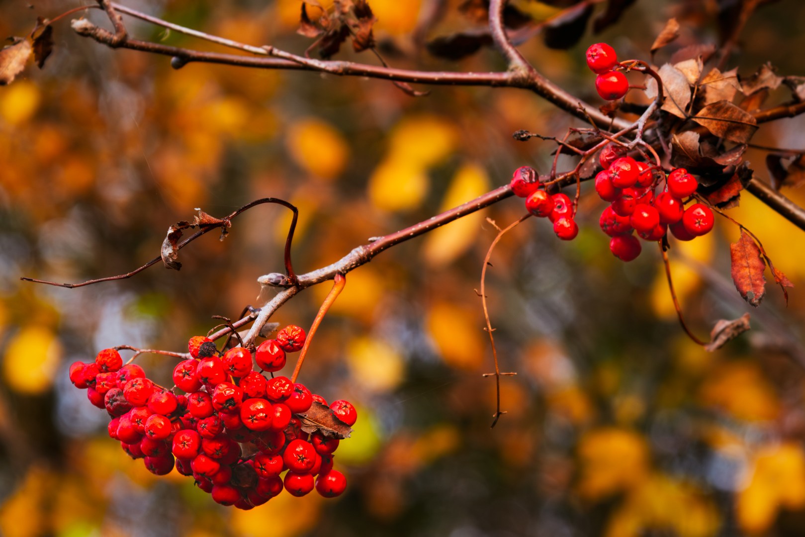
Red rowan berries among golden leaves — a simple autumn detail brought to life with warm tones and gentle contrast in Photoshop
There’s a certain kind of light that only autumn brings — warm, honey-gold, and fleeting. It turns ordinary leaves into glowing mosaics of red, orange, and yellow. But capturing that feeling in a photo doesn’t always come straight from the camera.
In this edition of Ride Photo Lab, I’ll walk you through how I developed a small set of autumn leaf portraits — rich red oaks, glowing yellows, and late-season greens — mainly in Photoshop using adjustment layers. For Lightroom users, I’ve added short notes at the end of each step showing how to achieve similar effects in Adobe Lightroom Classic.
These are simple, non-destructive techniques that preserve flexibility — perfect for hobbyist photographers who enjoy experimenting with tone and color while keeping a natural look.
1. Building the Autumn Base — Red Oak Leaves
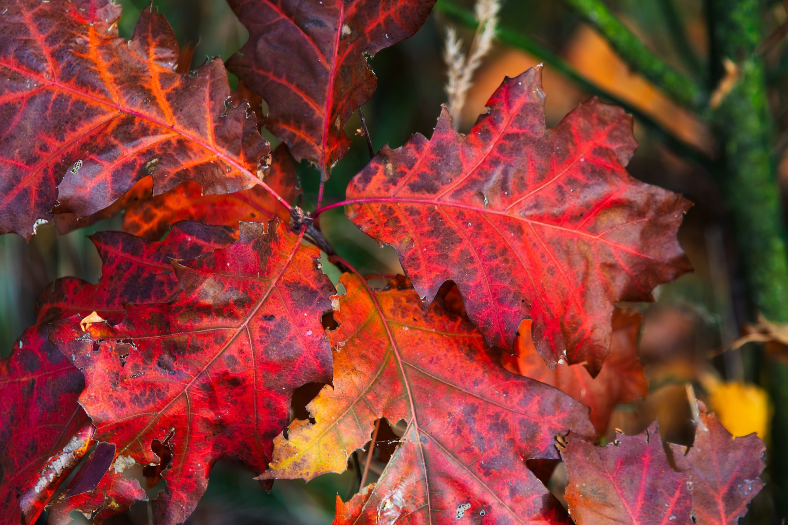
Red oak leaves glowing in soft autumn light — the base image for Photoshop color and contrast adjustments
The first image — a close-up of deep red and orange oak leaves — already had the color story I wanted. After basic preparation in Lightroom (dust removal, chromatic aberration correction, lens profile, and adaptive color profile), I exported the file to Photoshop, where the real shaping began.
Photoshop Steps
- Levels Adjustment — Moved the black point slider slightly right (the triangle below the histogram) to deepen shadows and increase contrast without losing detail.
- Curves — Added a soft S-curve to enhance midtone contrast and maintain warm highlights.
- Vibrance Layer — Boosted vibrance moderately to enrich reds while keeping oranges balanced.
- Hue/Saturation — Shifted reds subtly toward orange for a more natural, glowing autumn tone.
💡 Lightroom Tip: Use the Tone Curve to lower shadows and lift highlights for similar depth. The Vibrance slider offers a gentler, more balanced warmth than full Saturation.
2. Refining the Midtones — Yellow and Green Leaves
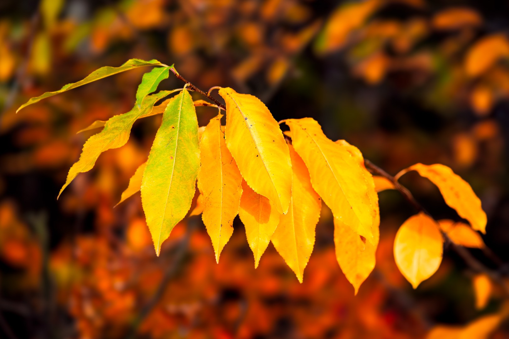
Yellow and green leaves capturing the smooth shift from late summer to golden autumn — refined in Photoshop for color harmony
This photo — a branch shifting from late-summer green to autumn gold — was all about capturing the transition between seasons.
Photoshop Steps
- Levels — A gentle rightward move of the black point for more depth.
- Curves — Lifted highlights slightly to make the yellow leaves shine.
- Selective Color — Adjusted Yellows (–5 Cyan, +3 Black) for richer tones.
- Color Balance — In midtones, a soft shift toward Red and Yellow for a golden cast.
- Optional Glow Layer — Duplicated the layer, applied Gaussian Blur (15–20 px), set to Soft Light, and lowered opacity to about 30%. This created a subtle, dreamy autumn glow.
💡 Lightroom Tip: The HSL panel offers precise control over yellows and oranges. Lower Luminance slightly, increase Saturation for depth, and experiment with Dehaze (–10) or a radial filter with reduced clarity to mimic that soft autumn glow.
3. Fine Polishing and Light Shaping
Once colors and tones feel balanced, subtle shaping helps guide the viewer’s eye and add atmosphere.
Photoshop Steps
- Curves + Masking — Darkened midtones, inverted the mask (Ctrl+I), then brushed softly around the background to push it deeper and make the subject stand out.
- Overlay Layer (50% Gray) — Painted with black around edges for a gentle vignette.
- Selective Color (Final Pass) — Balanced reds and yellows to maintain harmony.
- Camera Raw Filter — Added mild Texture +5, Clarity +4, and Dehaze +2, applied selectively to the leaves.
💡 Lightroom Tip: Use local adjustments like the Brush or Radial Mask for similar shaping. Apply a small negative exposure to darken the background, and increase Clarity only on your main subject to draw focus.
Final Thoughts
Every edit here follows one key idea — keep the light believable. Autumn already offers a cinematic color palette, so post-processing is more about guiding the viewer’s eye and refining relationships between tones than pushing saturation to extremes.
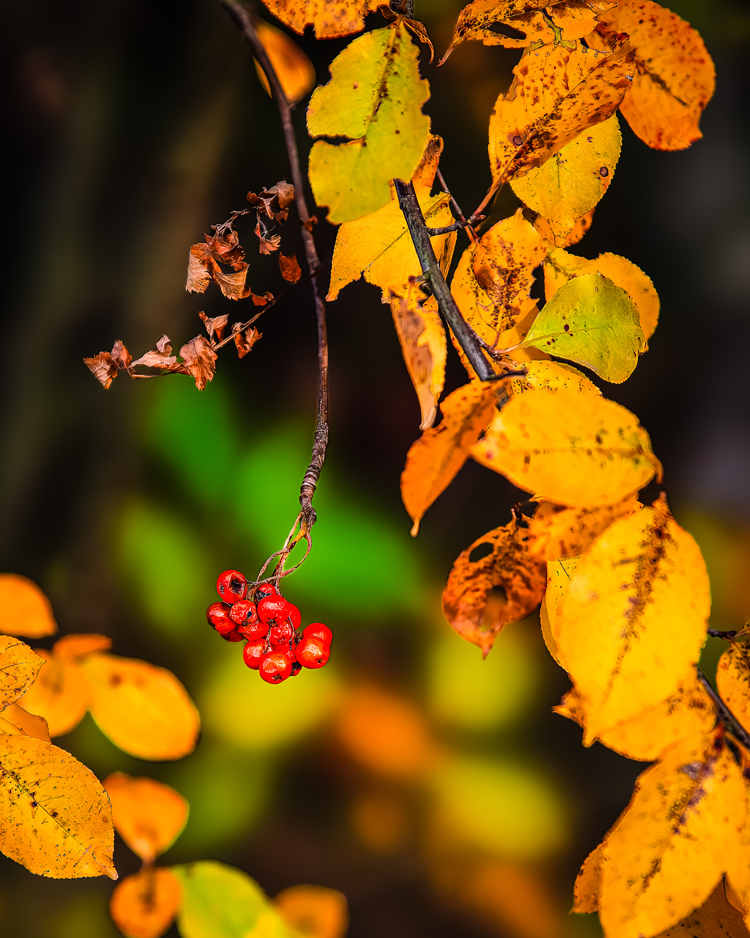
The last spark of color before winter — red berries glowing against a sea of fading gold.
Working with adjustment layers in Photoshop keeps every change reversible — ideal when exploring different moods or printing variations. Lightroom users can easily follow along using the Tone Curve, HSL, and Masking panels.
The result? Photos that keep the warmth and texture of the season — golden, alive, and true to how the forest feels when the leaves start to fall.
If you’ve captured your own golden autumn moments, give these adjustments a try — it’s amazing how much warmth and depth you can bring out with just a few layers and tweaks. And don’t forget to share your results — I’d love to see your version of this golden season!
Discover more from Shutter and Saddle
Subscribe to get the latest posts sent to your email.

Beautiful post!
LikeLiked by 1 person
Thank you! I’m glad you like it
LikeLike